archive
the site's archival. from where it began to now.
beginnings
i started neocities around early 2023 with nork.neocities.org out of curiosity and with motivation to learn more about html and css. i had some knowledge but most of it was css and some p and div id since i came from making spacehey layouts.
i gave up a few times... because im stubborn and want to know things right away LOL, but i started getting a hang of it. though most of the code was from tutorials and snippets.
nork.neocities.org
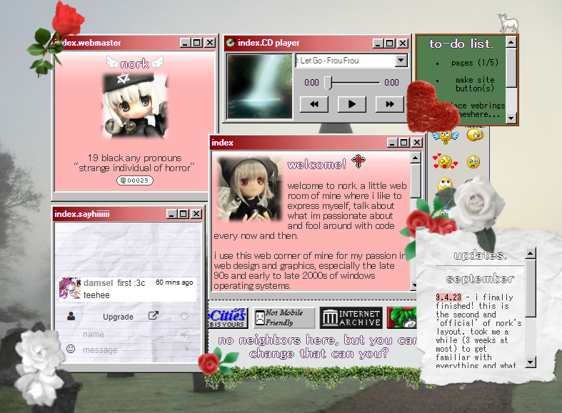
nork v1
my first site went by nork (my old name). it was a simple start but a little messy. it's first layout was a f2U template that i made into a red scenemo style. i went toying around with its code the more i spent time on the source page, along with looking at other's for inspiraton. unfortunately i dont have a snapshot of it :(. but i do have the under construction site capture before i went on to its second version.
button

NORK V2
i learned very quickly on HTML & CSS surprisingly, and went on with the second version of the site (this is where i started getting indecisive like always). it was a mash of windows 98, nature, and a bit of bibical horror? im not sure what vision i had for this layout but it was a fuck-ton lines of code (because i hated to use external css for some reason). looking at it makes me really nostalgic though. not because of the visuals, but because this was where i first started getting the hang of the coding languages.
there was a lot of absolute positioning and transform:translate with throwing a bunch of red/green/white pngs, which was a bunch of roses, everywhere. this is where i got the idea to make layouts look like collages at times.
button


NORK V3
i wasn't really fond with the second version of the site much. the way i coded it felt like it restricted me from getting in the contents i wanted on every page, so i threw it away.
as you can tell from the third version, i really liked the idea of using primary colors and associating them with nature, fruits, and the sky a bit. sort of like the windows XP logo's colors too. this is where i learned what display:flex is and how im never going to leave that display property alone LOL.i even learned what iframes are and more of linear-gradients
it didn't last long either. i was battling on whether i should host my site on neocities or another free web host, since to be honest, sometimes being on a popular domain felt a little intimidating - especially when i was rapidly getting followers. i moved to ichy.city for a while until i went, "ykno what im going back i miss it LMFAO". im a bit picky of some neocities aspects/dynamics (still am) but what can i do.
button


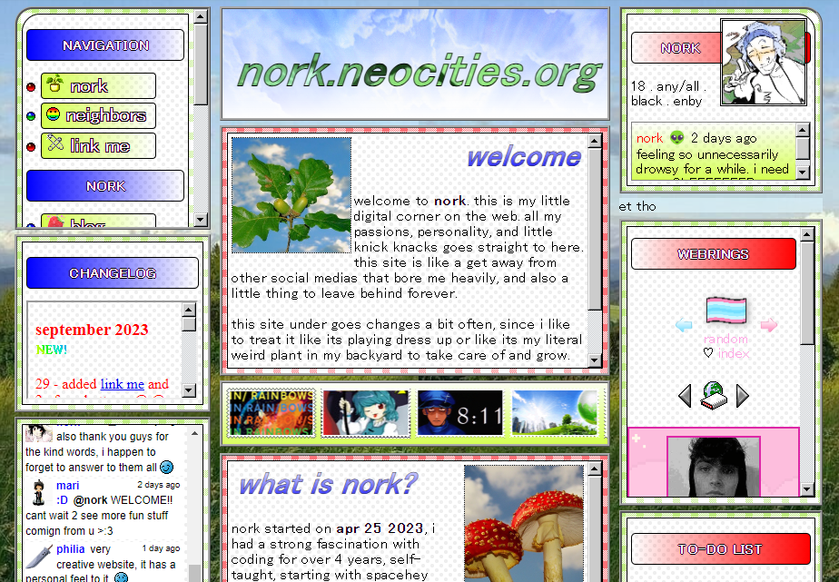
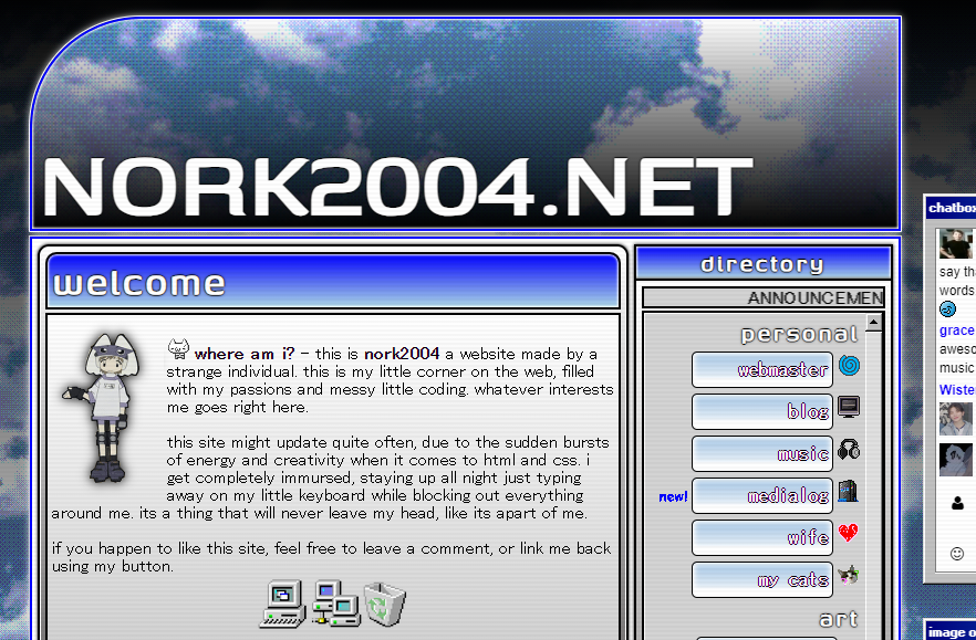
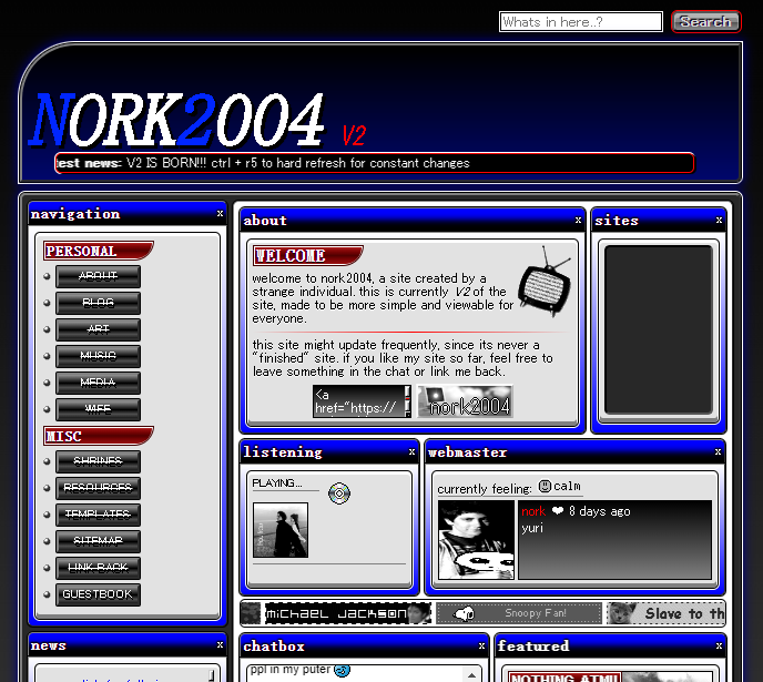
nork2004.neocities.org
nork2004 v1
my second site went by nork2004 (my name again but with my birth year added to it). and here is where i went full on BLUE!!! this is the only layout where i went "yeah im going to keep this for a long time", and in fact i did (a bit). it was really fun to code, cause at that time i pratically danced my way around html. and it was all thanks to that beautiful display:flex
one of my favorite colors is always blue. just the deep blue, and that was the top motivation for the index and main page. i don't know how i came up with the layout's vision, but you can tell that clouds, computers/old tech, and nostalgia was its main focus, and thats exactly what i wanted.
i started abusing linear-gradients, filters, and transitions more, dithering images to give it this screen filter type thing, and coming up with a whole kind of ways to use some png as a frame of a div on other pages. if theres a computer png, im turning that shit into a container.
button

nork2004 v1.5
yeaaah during this time i sorta lied about keeping version 1's layout for a "long time", but luckily i didn't keep it for long since it wasn't really working out + i realized how attached i was to version 1. though it was really fun to design!
this was heavily inspired by the old game pages back in the 2000s and other bitmap/pixelized sites during that era. what i really like about it is the color scheme. i some how thought that combining red, silver, and blue would be a great idea and i think it payed off. reminds me of pepsi...
i tried to go with a mobile compatibility approach but deemed my stylistic choices were too advanced for it. or i just wasn't good with making things compatible yet. maybe in the feature i'll learn it better.
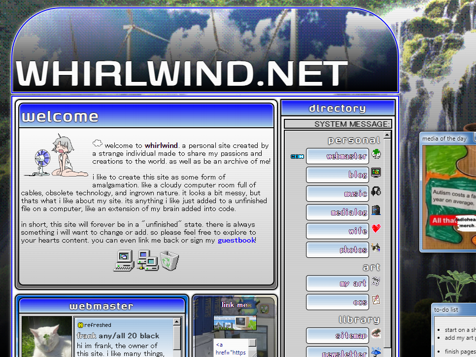
whirlwind.neocities.org
after a while, my motivation for coding started to burn out. important things in my personal life was killing my joy and dedication towards my site, and in general i needed to go step outside before the internet started to consume me. so i took a break.
after that break, i remembered that i just left my child unattended and went right back to neocities. all my feelings for my site was the same, my only issue was that name. i started growing out of the "nork" phase since #1 i dont go by that name anymore/hate it, #2 it started feeling like some brand with how i'd use that name on EVERYTHING, and #3 its ass and pretentious! its like im naming my child nork jr. i dont like jr names.
so i thought of other handles, something that matched the site rather than it being named after me. i thought of this one song by my favorite trip-hop band, Beauty's Confusion, and thought that it resinated more with the site. i re-named it Whirlwind.
felt like it was a big transition, so i decided to update the index and main page like it was in its spring season. and instead of the windows 98 css, i made it around windows 7.
button

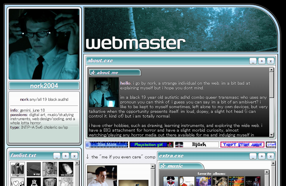
webmaster.html
webmaster v1
the webmaster page was one of the first files on the site that were uploaded along with the index and main page. this one was made to match the main page, and was more of a quick layout in order for me quit only having a main page every remaster :').
webmaster v2
this one was really fun to make! i liked how i made tab buttons as if it was an operating system UI. the teal, silver, and black color schemes felt a little more fresh. it was sort of made to match the images of Specs from Insidious a bit but the other reason was that the visual just popped out of no where. sometimes i get possessed making layouts and have no idea how i thought of it.
blog.html
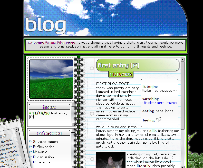
blog v1
a easy and quick blog page layout. its colors were inspired by the gif on the left section on top of the index. one problem i had with it is that i didnt seperate topics into sections with iframes, so it looked a bit cluttered. i didn't really like the notebook spiral either, looked weird and choppy as a transparent png. but other than that, this was a fun layout.
music.html
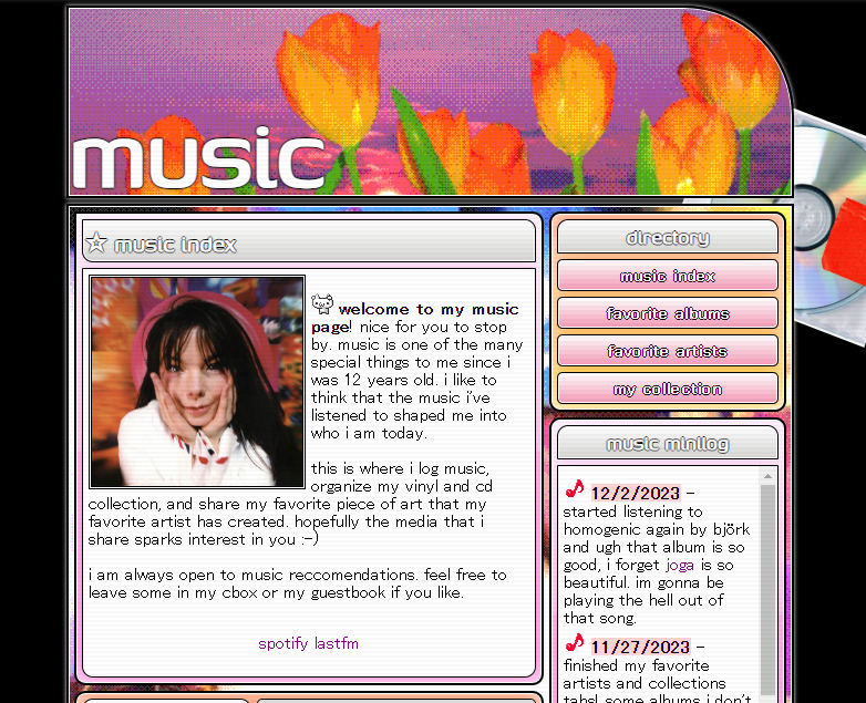
post
glad that i got the idea to make my music page layouts themed around Bjork's albums, since it gave me more creativity + this page is more fun to make layouts for out of the others (i wonder why). i have no idea why i didn't start with her first album, Debut... probably picked Post since it matched more with the header's background image.
i wish i did something more with the layout- cause it looks a bit plain? i just know i would've made it more abstract, but overall it was nice.
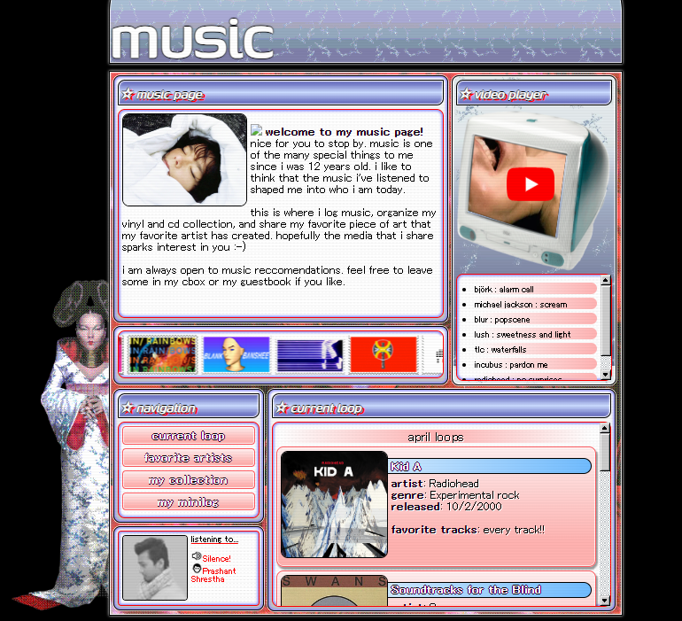
homogenic
oh this was a blast to make. this is probably one of my favorite layouts i made cause the color combos were so satisfying, especially the blue gradient of the headers combined with the red text-shadow.
medialog.html
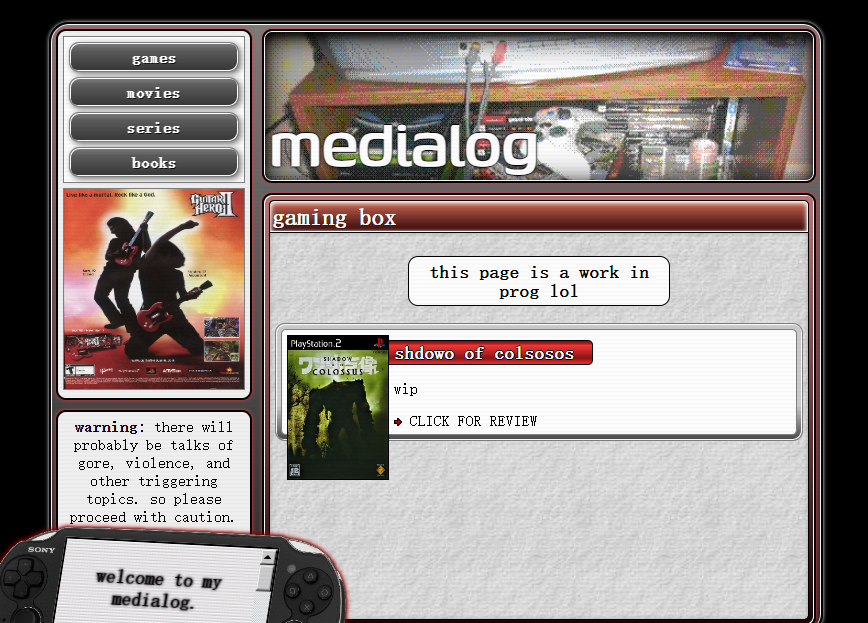
medialog v1
this page was originally going to be xbox 360 themed but scrapped because i already had a green layout on the site (blog). i kind of made it based off the Guitar Hero II png on the left i think, with the red, black, and silver. overall i wanted it to be like those video game sites in the 2000s a little.
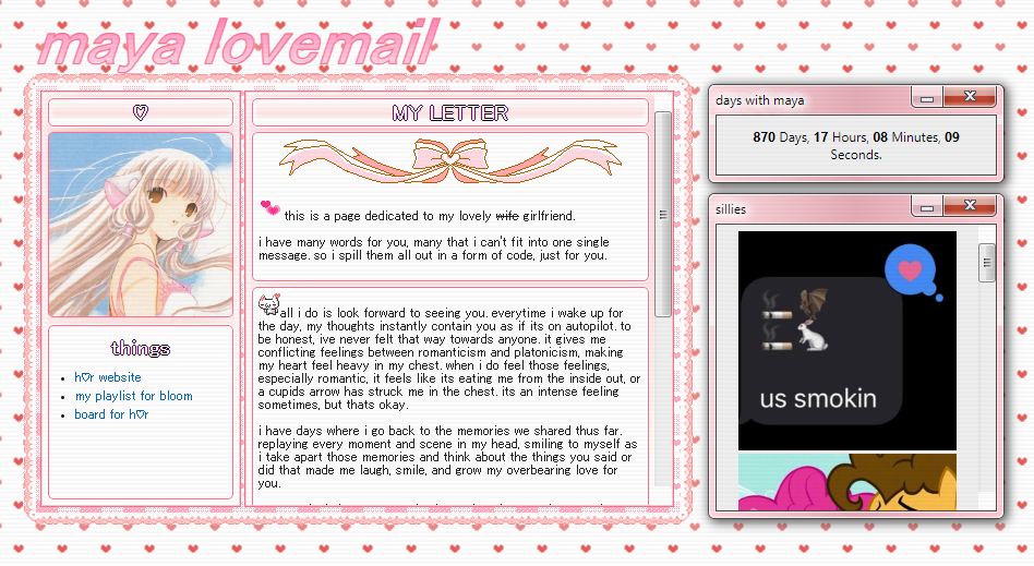
maya.html
wife
a love letter page made for my close friend of mine. even though we aren't together dating-relationship wise anymore, i still think its one of the more special pages i've made.
photos.html
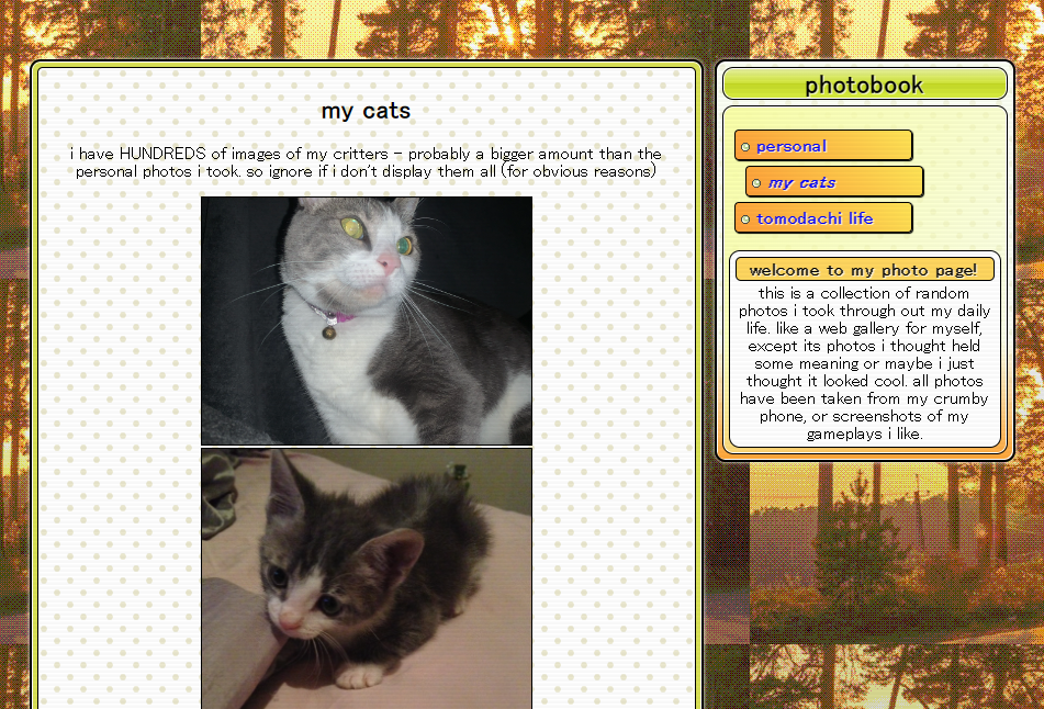
photos v1
sort of quick made, i really liked the fall/autumn theme i went for on this page. though i felt like it was a bit bland, especially on the left section where the photos are displayed. but still a nice layout.